| Author |
Message |
~A color is just a color~
Frozenwinters
Joined: 30 Aug 2007
Posts: 25292
HP: 1 MP: 0 Lives: 4
|
 Posted: Sun Sep 21, 2008 3:56 pm Posted: Sun Sep 21, 2008 3:56 pm
|
 |
|
http://i227.photobucket.com/albums/dd210/frozenwinters/Picture005.jpg
Linked for page stretch.
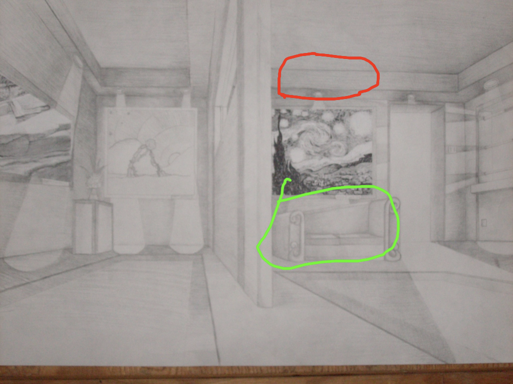
Anyway, I had to do this for art. ( Along with a bio on one of the paintings, and no, I couldn't write about myself. ;~; ) The lesson was about prospective art, so I decided to draw my gallery in the view of a mouse, but it doesn't really look that way, lol. I got lazy with the shading on the left side, and if anyone can point on my big mistake, I'll give them 75 coins. |
|
| Back to top |
|
 |
Crappiest Animator ever.
Chaos-Stev-0
Joined: 17 Jun 2008
Posts: 5728
HP: 100 MP: 0 Lives: 10
|
 Posted: Sun Sep 21, 2008 4:02 pm Posted: Sun Sep 21, 2008 4:02 pm
|
 |
|
|
I'm still wondering how you drew something as epic as that! |
|
| Back to top |
|
 |
Piano Enthusiast
Yoshifan
Joined: 09 Sep 2007
Posts: 1824
HP: 99 MP: 1 Lives: 0
|
 Posted: Sun Sep 21, 2008 4:06 pm Posted: Sun Sep 21, 2008 4:06 pm
|
 |
|
I think I found the mistake:
on the left side, the light on the right shines down over a painting and when it hits the ground, it's facing a different direction; i.e. it's crooked.
And it's perspective, not prospective. |
|
| Back to top |
|
 |
~A color is just a color~
Frozenwinters
Joined: 30 Aug 2007
Posts: 25292
HP: 1 MP: 0 Lives: 4
|
 Posted: Sun Sep 21, 2008 4:14 pm Posted: Sun Sep 21, 2008 4:14 pm
|
 |
|
| Spiritomb wrote: | I think I found the mistake:
on the left side, the light on the right shines down over a painting and when it hits the ground, it's facing a different direction; i.e. it's crooked. |
That's not it. |
|
| Back to top |
|
 |
Alice
MILF with a gun
Burning
Joined: 14 Oct 2007
Posts: 12888
HP: 57 MP: 0 Lives: 0
|
 Posted: Sun Sep 21, 2008 4:48 pm Posted: Sun Sep 21, 2008 4:48 pm
|
 |
|
I like it.
Is the mistake near the right side, where it looks like there's multiple lights shining multiple directions?
o-o; |
|
| Back to top |
|
 |
Yoshi
Vampire
Joined: 15 Dec 2007
Posts: 12475
HP: 60 MP: 6 Lives: 0
|
 Posted: Sun Sep 21, 2008 4:55 pm Posted: Sun Sep 21, 2008 4:55 pm
|
 |
|
I see afew minor things that could be it.
1. The light on the left shines over a painting, and makes the walls a heck of a lot brighter, but the painting has barely any difference.
2. A light comes out of a door, and the area left next to it is moderately dark, and an area next to that moderately dark part is lighter than the moderately dark part, despite being farther away from the light.
I'm guessing it's that second one.
On a side note: YOU ARE *crag* AWESOME FOR RECREATING STARRY NIGHT IN A MINIATURE COLORLESS FORMAT. |
|
| Back to top |
|
 |
High Priestess Paula
Count_Bleck
Joined: 27 Apr 2007
Posts: 29980
HP: 30 MP: 2 Lives: 9
|
 Posted: Sun Sep 21, 2008 6:01 pm Posted: Sun Sep 21, 2008 6:01 pm
|
 |
|
| Quote: |  |
The red part being kinda...curvey, or the green part being slanted, even though it should be flat?
...I'm wording that wrong, I know it. |
|
| Back to top |
|
 |
~A color is just a color~
Frozenwinters
Joined: 30 Aug 2007
Posts: 25292
HP: 1 MP: 0 Lives: 4
|
 Posted: Sun Sep 21, 2008 8:17 pm Posted: Sun Sep 21, 2008 8:17 pm
|
 |
|
I'll just tell you because none of you well get it. >.>
The painting on the left doesn't line up with my vanishing point. But I accidentally glued it on before I realized what I was doing.
Warai: No that's a window.
Yoshi: wut. :/
Maya: No that's me being sloppy. And the couch is just weird, but I like it. :> |
|
| Back to top |
|
 |
Alice
MILF with a gun
Burning
Joined: 14 Oct 2007
Posts: 12888
HP: 57 MP: 0 Lives: 0
|
 Posted: Sun Sep 21, 2008 8:33 pm Posted: Sun Sep 21, 2008 8:33 pm
|
 |
|
| Suigintou wrote: | I'll just tell you because none of you well get it. >.>
The painting on the left doesn't line up with my vanishing point. But I accidentally glued it on before I realized what I was doing.
Warai: No that's a window.
Yoshi: wut. :/
Maya: No that's me being sloppy. And the couch is just weird, but I like it. :> |
OKAY I SEE THAT NOW... |
|
| Back to top |
|
 |
|


