| Author |
Message |
TooManyToasters
Paper_Waluigi
Joined: 20 May 2007
Posts: 10343
HP: 100 MP: 10 Lives: 1
|
 Posted: Sat Dec 06, 2008 1:05 am Posted: Sat Dec 06, 2008 1:05 am
|
 |
|
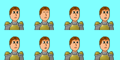
But I've been practicing with some pixelart. I'm far from being actually good, but I might as well post what I managed to do.

This is an unnamed character for my RPG. He won't look like this in the full version; this is just practice.
Last edited by Paper_Waluigi on Sun Dec 07, 2008 7:21 pm; edited 3 times in total |
|
| Back to top |
|
 |
lolz
Shrowser
Joined: 16 Jul 2007
Posts: 8814
HP: 100 MP: 4 Lives: 0
|
 Posted: Sat Dec 06, 2008 8:39 am Posted: Sat Dec 06, 2008 8:39 am
|
 |
|
Overall, they're pretty good, but a couple things about the face are bugging me.
The eyes are pretty high up on the guy's face. Lowering them to right above the nose would look better. Also, the nose itself doesn't really look like a nose. It just looks like a lump or something. Try maybe adding a bottom to it, or like, nostrils or something. |
|
| Back to top |
|
 |
TooManyToasters
Paper_Waluigi
Joined: 20 May 2007
Posts: 10343
HP: 100 MP: 10 Lives: 1
|
 Posted: Sat Dec 06, 2008 9:50 am Posted: Sat Dec 06, 2008 9:50 am
|
 |
|
|
Lowered the eyes by 1 pixel and rounded off the nose. Thanks for the input. |
|
| Back to top |
|
 |
lolz
Shrowser
Joined: 16 Jul 2007
Posts: 8814
HP: 100 MP: 4 Lives: 0
|
 Posted: Sat Dec 06, 2008 10:52 am Posted: Sat Dec 06, 2008 10:52 am
|
 |
|
| TooManyToasters wrote: | | Lowered the eyes by 1 pixel and rounded off the nose. Thanks for the input. |
That looks a ton better. |
|
| Back to top |
|
 |
~A color is just a color~
Frozenwinters
Joined: 30 Aug 2007
Posts: 25292
HP: 1 MP: 0 Lives: 4
|
 Posted: Sat Dec 06, 2008 1:28 pm Posted: Sat Dec 06, 2008 1:28 pm
|
 |
|
|
The eyes and the nose still kind of look weird though. I suggest chopping one pixl off the top of the bridge of the nose, and bringing the eyes 2 pixls down. |
|
| Back to top |
|
 |
that confounded bridge
Abstract
Vampire
Joined: 26 Jan 2008
Posts: 2521
HP: 82 MP: 10 Lives: 3
|
 Posted: Sat Dec 06, 2008 1:45 pm Posted: Sat Dec 06, 2008 1:45 pm
|
 |
|
Hm... pretty good.
The guy needs a forehead, though. Lower the eyes until it fits the proportions of the human face to some degree (these can be found in pretty much any artbook, or by Googling it).
His eyes are too close together as well, and the crosseyed look looks a little odd.
The shape of his neck could use a little work, and she shoulders slant down a little too much, imo.
I like your colouring, but some of the shadows just don't blend in well enough. If you plan on doing pixel art and not sprites, try using lots of colours to make an almost gradient effect. For sprites, use colours that can be reused in different areas, yet still blend together. The trick in making game sprites is to use as little colours as possible, and to make these colours look as natural as possible.
Nonetheless, I think this looks great, and I think you should keep up the good work. |
|
| Back to top |
|
 |
TooManyToasters
Paper_Waluigi
Joined: 20 May 2007
Posts: 10343
HP: 100 MP: 10 Lives: 1
|
 Posted: Sun Dec 07, 2008 7:23 pm Posted: Sun Dec 07, 2008 7:23 pm
|
 |
|
|
Updated. I took Abstract's advice about the nose bridge and the shading, and his armor in particular looks pretty good now. I did some shading on his chainmail as well, which took a bit of work. |
|
| Back to top |
|
 |
Crappiest Animator ever.
Chaos-Stev-0
Joined: 17 Jun 2008
Posts: 5728
HP: 100 MP: 0 Lives: 10
|
 Posted: Sun Dec 07, 2008 7:25 pm Posted: Sun Dec 07, 2008 7:25 pm
|
 |
|
|
Eyes and nose are a bit....meh, but the shading is awesome! I wish I could shade things like that. |
|
| Back to top |
|
 |
~A color is just a color~
Frozenwinters
Joined: 30 Aug 2007
Posts: 25292
HP: 1 MP: 0 Lives: 4
|
 Posted: Sun Dec 07, 2008 9:42 pm Posted: Sun Dec 07, 2008 9:42 pm
|
 |
|
| TooManyToasters wrote: | | Updated. I took Abstract's advice about the nose bridge and the shading, and his armor in particular looks pretty good now. I did some shading on his chainmail as well, which took a bit of work. |
That was my idea. ;o; |
|
| Back to top |
|
 |
Bartz Klauser
BAMFing ARCHER
Werewolf
Joined: 27 Sep 2007
Posts: 7637
HP: 100 MP: 5 Lives: 4
|
 Posted: Sun Dec 07, 2008 10:18 pm Posted: Sun Dec 07, 2008 10:18 pm
|
 |
|
|
There are some things you could add to the armor to make it look better. Generally, I'd have a set colour scheme for a kingdom(if the character is affiliated to it), and use that, as well as a crest on either his pauldron or his chestplate. And, as a recommendation, personalize the armor, make it reflect the character. Maybe add something of a neck/mouthguard there, which would merely be an extension of the suit. Maybe slightly bigger pauldrons would be nice. And shift the pauldrons down a tad, they seem rather high up. |
|
| Back to top |
|
 |
|


