| |
|
|
Hey [you]! If you haven't noticed, this is now the old digibutter forums. Go over to the new site!
digibutter.nerr
It's Hi-Technicaaal!
|
| Author |
Message |
Elzilcho
ohclizlE
Burning Vampire
Joined: 08 Oct 2007
Posts: 6715
HP: 94 MP: 5 Lives: 0
|
 Posted: Sun Jan 25, 2009 12:00 pm Posted: Sun Jan 25, 2009 12:00 pm
|
 |
|
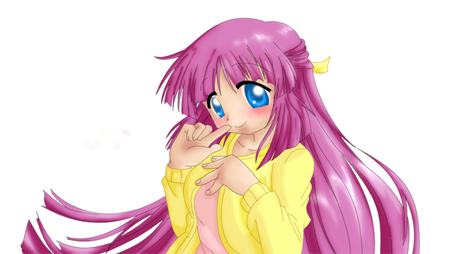
Yes, I realise Petey's drawn exactly the same person in the topic below. Sorry to tread on your toes, Petey.
I started this last weekend, because I wanted to get used to using my tablet, although I'm still not used to drawing smaller features (which is why his head/face is so... yeah...). I got bored, so I stopped half way through.

Comments, constructive criticism, etc. welcome.
Last edited by ohclizlE on Sun Jan 25, 2009 1:29 pm; edited 1 time in total |
|
| Back to top |
|
 |
Fat Tuper
lovegod703
Joined: 06 May 2008
Posts: 5515
HP: 10 MP: 6 Lives: 0
|
 Posted: Sun Jan 25, 2009 12:07 pm Posted: Sun Jan 25, 2009 12:07 pm
|
 |
|
The topic below is mine... 
Other than that, I think it's... I don't know what word to use. It's better than mediocre, but it's not something to say "OMFG EPIC" to. I think the style is a little... odd, and the face could use some work.
> |
|
| Back to top |
|
 |
~A color is just a color~
Frozenwinters
Joined: 30 Aug 2007
Posts: 25292
HP: 1 MP: 0 Lives: 4
|
 Posted: Sun Jan 25, 2009 12:17 pm Posted: Sun Jan 25, 2009 12:17 pm
|
 |
|
Best way to draw small details is make your picture large and then shrink it in the end.
I don't really like what the lines are doing throughout the picture. They go small and then fat in no particular scheme. D: If your tablet draws on pressure I guess that's not really your fault. ( I usually turn the pressure thing off except when shading certain things. )
Another thing that looks a little weird is the light source. Something that usually helps me is to draw a little sun ( THAT I WILL ERASE IN THE END ) in the sky to help me keep my highlights in order. ( Please note that a lot of anime drawings bend lights for some reason. )
And lastly, I suggest you put all your colours in different layers. It helps the picture become a bit more organized. So if you mess up with one colour you can just erase.
Usually my layer thing looks like this;
-Ink
-Shine
-Eye Ink ( I usually leave the eyes separate so that white spots can go over them but not the ink. )
-Highlights
-Midtones
-Skin
-Highlights
-Midtones
-Hair ( Of course your picture doesn't have hair. )
-Highlights
-Midtones
-Clothes
-Detail
-Eyes
-Highlights
-Midtones
-Other
Layers like clothes, hair, skin, eyes and other are used just for the basic colour. Midtones I use next to shade. There are a number of ways to do that, I'm not very consistent with my shading techniques. Then highlights for where the sun would hit. Again, not so consistent with that one.
It may look weird and stuff, but that's my basic layer page outline. D:
HOPE THIS HELPS SOME. |
|
| Back to top |
|
 |
Elzilcho
ohclizlE
Burning Vampire
Joined: 08 Oct 2007
Posts: 6715
HP: 94 MP: 5 Lives: 0
|
 Posted: Sun Jan 25, 2009 1:19 pm Posted: Sun Jan 25, 2009 1:19 pm
|
 |
|
Holy crap, I hadn't expected this many tips :O
After I had drawn the face, I had realised about the whole 'draw large then shrink', so I'll keep that one in mind for the future.
I guess I could turn the pressure bit off, but I sort of like having a 'flowing' look to my line, although apparently that doesn't look as good as I imagined.
About the light source, I used a reference (can't draw from memory for shit), and I followed the lighting from that. Maybe I should stop relying on that so much?
I did use layers for different parts of my image, although my layout was a little different, having simply outline, then colour underneath for each body part/feature. This meant that highlights were put together with the 'original' colour. I wanted to keep a more simplistic colour scheme, due to the game's cartoony look, but I guess I should pay more attention to shading. Would you suggest doing 'normal' colours first, then putting shading in over the top (for each layer) after finishing completely?
Thanks for all the tips, by the way :U |
|
| Back to top |
|
 |
~A color is just a color~
Frozenwinters
Joined: 30 Aug 2007
Posts: 25292
HP: 1 MP: 0 Lives: 4
|
 Posted: Sun Jan 25, 2009 1:23 pm Posted: Sun Jan 25, 2009 1:23 pm
|
 |
|
That's usually what I do.
PAGE STRETCH


 |
|
| Back to top |
|
 |
Elzilcho
ohclizlE
Burning Vampire
Joined: 08 Oct 2007
Posts: 6715
HP: 94 MP: 5 Lives: 0
|
 Posted: Sun Jan 25, 2009 1:28 pm Posted: Sun Jan 25, 2009 1:28 pm
|
 |
|
Ah, that's much clearer for me. Thanks Frozen.
(I think I'll just put a pagestretch warning lulz) |
|
| Back to top |
|
 |
Bartz Klauser
BAMFing ARCHER
Werewolf
Joined: 27 Sep 2007
Posts: 7637
HP: 100 MP: 5 Lives: 4
|
 Posted: Sun Jan 25, 2009 1:29 pm Posted: Sun Jan 25, 2009 1:29 pm
|
 |
|
Now someone tell me how you guys do this. I really want to learn.
I don't want to be stuck with sketches forever.
But on the subject of Elzilcho's art, it's pretty good, and colorful...well, compared to my work. |
|
| Back to top |
|
 |
|
Powered by phpBB © 2001, 2005 phpBB Group
|
|
|


