Good news! Each year, the Academy of Interactive Arts & Sciences (ITP) and the Entertainment Software Association (ESA) present the Into The Pixel art exhibit, a collection of videogame artwork hand-picked by experts from the traditional fine art world and the interactive entertainment industry.
This year, we’re excited to share that art from four exclusive PlayStation titles is included in this year’s list of winners – The Last of Us (PS3), Journey (PSN), Gravity Rush (PS Vita) and wipEout 2048 (PS Vita) were chosen for this year’s collection. This is a true honor for SCEA and our developers.
Browse the gallery below to see the award-winning pieces (click to see the high-resolution versions) and read a few words from their creators. Congratulations all around!
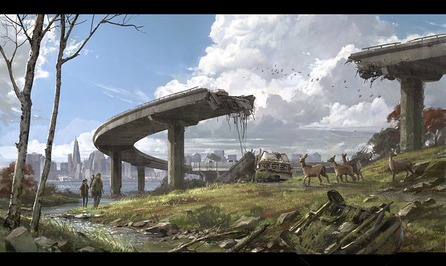
The Last of UsDeveloped by Naughty Dog, Inc.
“Broken Overpass” by Shaddy Safadi
Early in the pre-production of The Last of Us we all gravitated toward the idea of “beautiful decay” and “nature reclaiming the Earth.” We also knew that if we were going to go for survival action we had to push it a different direction. Certainly there would have to be moments of darkness and fear, but as much as possible we wanted to capture the awe and mystery that inherently comes from seeing something man-made being slowly overtaken by nature. There is an insane love of detail at Naughty Dog…not just a desire for detail but a LOVE for it. The way a rust texture creates a pattern on a disused soda machine, the way light bounces and reflects through leaves, and the story behind how these things got the way they are.
In this piece, we had started with no overpass and giraffes instead of deer! Our thought was that they escaped from the zoo, but after some iteration we realized that the idea looked silly. We ended up with deer, and the overpass was a last minute add-in to give some movement to the piece; but it ended up being the focus. We also tried three or four placements of Joel and Ellie, coming in from the foreground, coming in from the right and in the end I decided showing their small scale was the most compelling.
I love the way this game is shaping up and I’m grateful for this incredible honor from Into the Pixel. –Shaddy Safadi, artist

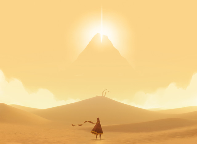
Developed by thatgamecompany
“The Call to Adventure” by Matt Nava
I’m glad this piece was chosen as this was taken directly from the game. This art piece is a collaboration between Art Director Matt Nava and Lead Engineer John Edwards, and one that captures the mood and essence of Journey. –Jenova Chen, Creative Director, thatgamecompany

Developed by Sony Computer Entertainment Japan Studio
“Gravity Daze” by Takeshi Oga
This is the scenery of Vendecentre, the biggest downtown area of Hekseveille in PS Vita’s upcoming open-world adventure Gravity Rush. I designed a great deal of scenery surrounding the city for this project. What I tried to achieve in this piece of art was to capture the best part of Hekseville and its surrounding atmosphere. The game itself is a series of intense action sequences; however in this image for a brief, quiet moment, our protagonist looks over her shoulder and sees the view.
When I was working on this piece, I had no idea that it would be used for the package art. I’m so pleased that our team found it to be such a defining representation of the game that they selected it for the cover.
Concept artists from overseas have always influenced me and that’s how I started working in this industry. I was not sure if my concept art would be accepted and valued overseas; so I am extremely happy and honored that my artwork was chosen for the Into the Pixel collection. I feel fortunate to be able to work on such a great title as Gravity Rush that inspires your imagination endlessly. –Takeshi Oga, Artist

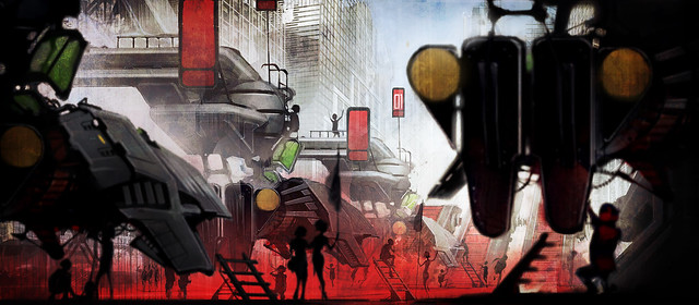
Developed by SCE Studio Liverpool
“The 2048 Grid” by Darren Douglas // Art Directors Lee Carus and Marcus Tanner
The team has created a bunch of start-grids over the years in various Wipeout titles, and while it’s not something we usually get to explore in game too much, we all get excited and brainstorm ideas for just how those little pilots get into the ships and just how exciting it would be to be in that arena as the ships are being prepped for the race – the sounds, the smells, the anticipation. We always get carried away. This time, the race takes place on real city streets so we decided to have the ships and the pilots brought into the arena with much more fanfare in larger drop-ships and deposited on the race grid while the crowd looks on.
This image came as a bit of a surprise to me, it started off as a simple study of the unfolding gantry that holds the ship in check while doubling as the gangway for the pilot to get from the drop-ship to his or her racer….it ballooned into something a bit more intense, and once again, I got carried away. I added a city backdrop I’d created for an earlier image just to give it a little context. Now that I’d done the job of showing off the mechanism I realized I could put that version to one side and make another image which sacrificed the clarity of the mechanism for some real ground level intensity, something akin to the prepping of fighter jets on an aircraft carrier or the classic sci-fi launch sequences we all loved as kids. So I duped the ship fore and aft and was able to get some depth and chaos into the image.
In a previous concept I’d added large strips of intense red lighting on the ground that would change to amber, then to green as the race kicks off. This justified the intensity of the red under-glow that adds a little energy to the scene. So pretty quickly I’d wound up with a pic that seemed to sell a little of the drama of the race grid world. This is why I love the versatility of working on a computer, although I still can’t seem to drop that pencil for the initial stages. I’m pleased that this image has been accepted by ITP. It’s a good feeling when an image seems to work out – it more than makes up for all the ones that don’t! – Darren Douglas, artist // Art Directors Lee Carus and Marcus Tanner

For more information on Into the Pixel, please be sure to visit their official website.
